What Is an Equity Curve? How to Read the Shape
An equity curve is a chart of an account's value over time. On a serious account page it is drawn as two lines rather than one: balance, which counts only closed trades, and equity, which adds the floating profit and loss of everything still open. The distance between them is the part of the story the account has not admitted yet.
How it works
Equity = Balance + Floating P&L on open positions
When nothing is open, the two lines sit on top of each other. When positions are open, equity moves and balance does not. A losing position that is never closed keeps the balance line flat and pushes the equity line down; closing it drops the balance line to meet equity, which is why a "sudden" loss on a balance chart is usually weeks old.
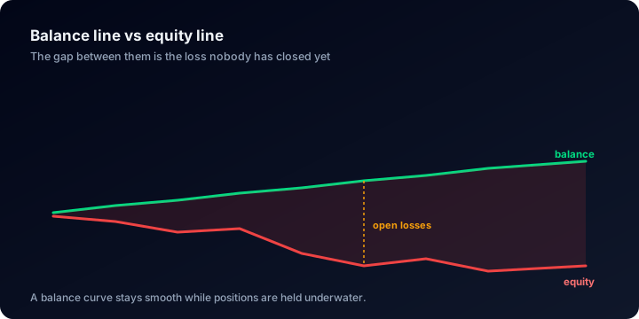
A balance line stays tidy for as long as the losers stay open.
Deposits and withdrawals move both lines vertically without any trading happening, which is why a raw curve cannot be read as a return. That correction is what time-weighted return exists to make.
The shape carries as much information as the endpoint:
- Jagged, rising, with visible pullbacks. Normal. Every strategy has losing runs, and their absence is the anomaly.
- A near-straight diagonal on the balance line. A warning, not a compliment. It usually means losers are held open while winners are closed (grid, averaging-down or martingale behaviour), and the risk has moved into the equity line where a balance-only chart cannot show it.
- Long flat stretches broken by vertical steps. Position sizing changed, or the account traded rarely and heavily. Read the trade count before reading the slope.
- A clean climb that ends abruptly. The classic single-blow-up shape: many small wins funding one loss large enough to end the account.
Why it matters
The curve is where duration becomes visible. A headline number tells you the worst drawdown was 18%; only the curve tells you it lasted nine months, which is the part people actually quit over.
It is also the fastest lie detector on a track record. Claims are made about returns, rarely about shape, and the shape is much harder to manufacture: a balance line that has never had a bad week either did not trade through one or is not closing its bad trades.
What the data shows
The figures below describe accounts published on ShowMyTrades, not traders in general. Across the published accounts that have trading history (August 2026), the median deepest drawdown is 9.7% measured on equity. 38.5% of accounts have never been more than 5% below their own peak, 38.2% have been more than 20% below it, and 17.6% more than 50% below.
Set that beside a median time-weighted return of +3.2% and the honest shape appears: modest slope, real dents, and a worst dent several times larger than the eventual gain. The median account arrived there over 171 closed trades, which is the context every smooth-looking curve has to be read against: the fewer trades behind a curve, the less its smoothness can mean.
The equity-versus-balance gap is measurable too. Every account carries both a Drawdown figure on equity and a DD on Balance figure on closed results only. A wide gap between the two is the numeric version of the straight-diagonal warning: the balance line is being kept tidy by positions that are still open.
Where you see it on ShowMyTrades
The charts viewer on every published account page is a single panel that switches between five views: Growth, Balance, Profit, Growth by Trade and Drawdown, rather than a stack of separate charts.
Balance is the equity curve proper. It draws two named series, Balance and Equity, with a legend, so the floating gap is visible rather than inferred; deposits and withdrawals are marked on the line, so a jump reads as funding rather than trading. Growth replots the same account as compounded time-weighted return, with cash flows removed. Drawdown plots the daily distance below the high-water mark as bars, which is where the length of a decline is readable.
The numeric anchors are in the Account Stats panel: Balance, Equity (printed as a percentage of balance alongside the amount, so a large floating loss is obvious at a glance) and Highest $, the peak the account has ever reached. Drawdown and DD on Balance sit on the two rows below Avg Monthly % in the same panel.
Common misunderstandings
- "A smooth equity curve means low risk." It often means the opposite. Smoothness on the balance line is the signature of never realising a loss, and the risk is sitting in the equity line and in maximum drawdown.
- "The equity curve is the balance chart." Balance is closed trades only. Equity includes open ones, and the difference is exactly the amount not yet accounted for.
- "The curve rose, so the trading worked." Not until deposits are removed. That is why Gain on our pages is time-weighted and Abs. Gain is shown separately.
- "A new high means the account recovered." It means balance recovered. If it was reached by increasing position size after a loss, the account did not recover: it doubled down and got away with it.
For how a curve's shape gives away a manufactured result, see spotting fake EA results.
Related terms
Profit Factor
Profit factor is gross profit divided by gross loss. Below 1.0 an account loses by construction. Here are the bands and the 1.28 median across thousands of accounts.
Drawdown
Drawdown is the peak-to-trough fall in an account's value, in percent. Here is the formula, why it is cumulative, and what thousands of real trading accounts show.
Maximum Drawdown
Maximum drawdown is the deepest peak-to-trough fall an account ever recorded. The formula, the recovery table, and the real spread across thousands of accounts.
Time-Weighted Return
Time-weighted return compounds sub-period returns so deposits and withdrawals drop out. The formula, how it differs from Abs. Gain, and public accounts.